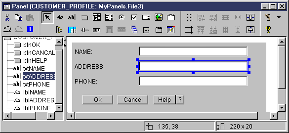
Figure 1 shows the GUI Builder Panel Builder window. Following Figure 1 is a list that shows each Panel Builder tool icon and describes its function.
Figure 1: The GUI Builder Panel window
 Click
Pointer to move and resize a component on a panel.
Click
Pointer to move and resize a component on a panel.
 Click
Label to insert a static label on a panel.
Click
Label to insert a static label on a panel.
 Click
Text to insert a text box on a panel.
Click
Text to insert a text box on a panel.
 Click
Button to insert a button on a panel.
Click
Button to insert a button on a panel.
 Click
Combo Box to insert a drop down list box on a panel.
Click
Combo Box to insert a drop down list box on a panel.
 Click
List Box to insert a list box on a panel.
Click
List Box to insert a list box on a panel.
 Click
Radio Button to insert a radio button on a panel.
Click
Radio Button to insert a radio button on a panel.
 Click
Checkbox to insert a check box on a panel.
Click
Checkbox to insert a check box on a panel.
 Click
Spinner to insert a spinner on a panel.
Click
Spinner to insert a spinner on a panel.
 Click
Image to insert an image on a panel.
Click
Image to insert an image on a panel.
 Click
Menu Bar to insert a menu bar on a panel.
Click
Menu Bar to insert a menu bar on a panel.
 Click
Group Box to insert a labeled group box on a panel.
Click
Group Box to insert a labeled group box on a panel.
 Click
Tree to insert an hierarchical tree on a panel.
Click
Tree to insert an hierarchical tree on a panel.
 Click
Table to insert a table on a panel.
Click
Table to insert a table on a panel.
 Click
Slider to insert an adjustable slider on a panel.
Click
Slider to insert an adjustable slider on a panel.
 Click
Progress Bar to insert a progress bar on a panel.
Click
Progress Bar to insert a progress bar on a panel.
 Click
Deck Pane to insert a deck pane on a panel. A deck pane contains a stack of
panels. The user can select any of the panels, but only the selected panel
is fully visible.
Click
Deck Pane to insert a deck pane on a panel. A deck pane contains a stack of
panels. The user can select any of the panels, but only the selected panel
is fully visible.
 Click
Split Pane to insert a split pane on a panel. A split pane is one pane divided
into two horizontal or vertical panes.
Click
Split Pane to insert a split pane on a panel. A split pane is one pane divided
into two horizontal or vertical panes.
 Click
Tabbed Pane to insert a tabbed pane on a panel. A tabbed pane contains a collection
of panels with tabs at the top. The user clicks a tab to display the contents
of a panel. The title of the panel is used as the text for a tab.
Click
Tabbed Pane to insert a tabbed pane on a panel. A tabbed pane contains a collection
of panels with tabs at the top. The user clicks a tab to display the contents
of a panel. The title of the panel is used as the text for a tab.
 Click
Custom to insert a custom-defined user interface component on a panel.
Click
Custom to insert a custom-defined user interface component on a panel.
 Click
Toolbar to insert a toolbar on a panel.
Click
Toolbar to insert a toolbar on a panel.
 Click
Toggle Grid to enable a grid on a panel.
Click
Toggle Grid to enable a grid on a panel.
 Click
Align Top to align multiple components on a panel with the top edge of a specific,
or primary, component.
Click
Align Top to align multiple components on a panel with the top edge of a specific,
or primary, component.
 Click
Align Bottom to align multiple components on a panel with the bottom edge
of a specific, or primary, component.
Click
Align Bottom to align multiple components on a panel with the bottom edge
of a specific, or primary, component.
 Click
Equalize Height to equalize the height of multiple components with the height
of a specific, or primary, component.
Click
Equalize Height to equalize the height of multiple components with the height
of a specific, or primary, component.
 Click
Center Vertically to center a selected component vertically relative to the
panel.
Click
Center Vertically to center a selected component vertically relative to the
panel.
 Click
Toggle Margins to view the margins of the panel.
Click
Toggle Margins to view the margins of the panel.
 Click
Align Left to align multiple components on a panel with the left edge of a
specific, or primary, component.
Click
Align Left to align multiple components on a panel with the left edge of a
specific, or primary, component.
 Click
Align Right to align multiple components on a panel with the left edge of
a specific, or primary, component.
Click
Align Right to align multiple components on a panel with the left edge of
a specific, or primary, component.
 Click
Equalize Width to equalize the width of multiple components with the width
of a specific, or primary, component.
Click
Equalize Width to equalize the width of multiple components with the width
of a specific, or primary, component.
 Click Center Horizontally to center a selected component
horizontally relative to the panel.
Click Center Horizontally to center a selected component
horizontally relative to the panel.
 Click
Cut to cut panel components.
Click
Cut to cut panel components.
 Click
Copy button to copy panel components.
Click
Copy button to copy panel components.
 Click
Paste to paste panel components between different panels or files.
Click
Paste to paste panel components between different panels or files.
 Click
Undo to undo the last action.
Click
Undo to undo the last action.
 Click
Redo to redo the last action.
Click
Redo to redo the last action.
 Click
Tab Order to control the selection order of each panel component when the
user presses TAB to navigate through the panel.
Click
Tab Order to control the selection order of each panel component when the
user presses TAB to navigate through the panel.
 Click
Preview to display a preview of what a panel will look like.
Click
Preview to display a preview of what a panel will look like.
 Click
Help to get more specific information about the Graphical Toolbox.
Click
Help to get more specific information about the Graphical Toolbox.