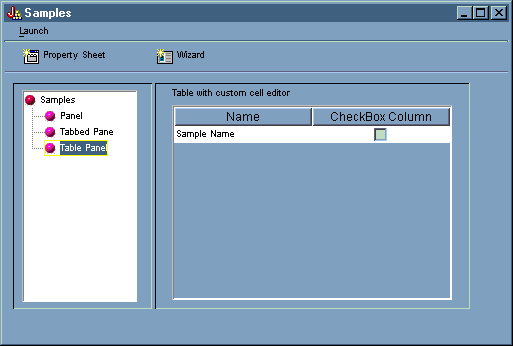
When the examples contained in this section are put together with the correct data beans working behind the scenes, you get a total GUI application.
Figure 1 shows the first panel that displays when you run this example.
Figure 1: The GUI Builder example main window
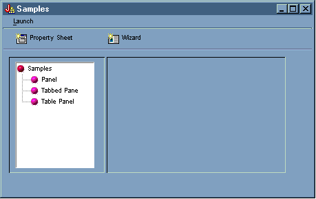
Notice that this screen allows you to use the dynamic panel manager. Figures 2 and 3 show how you can resize the window to be larger or smaller.
Figure 2: Resizing the GUI Builder example main window (larger)
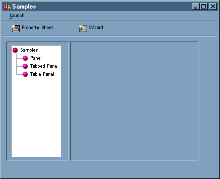
Figure 3: Resizing the GUI Builder example main window (smaller)
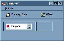
When you use the dynamic panel manager, while the size of the panel and the panel controls changes, the size of the text does not.
The panel allows you to perform the following actions:
You can launch the property sheet by clicking the Property Sheet toolbar button or by using the Launch menu. Being able to choose between the toolbar and the menu illustrates linking menu items. Figure 4 shows Property Sheet being selected from Launch menu on the GUI Builder example main window.
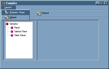
Selecting Property Sheet displays the panel in Figure 5.
Figure 5: Property Sheet Sample dialog
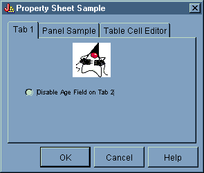
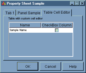
When the Property Sheet Sample first appears, Tab 1 displays by default. Figures 6 and 7 show how the panel display changes when you select the other tabs.
Figure 6: Selecting the Panel Sample tab
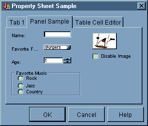
Figure 7: Selecting the Table Cell Editor tab
You can launch the wizard by clicking the Wizard toolbar button or by using the Launch menu. Being able to choose between the toolbar and the menu illustrates linking menu items. Figure 8 shows Wizard being selected from Launch menu on the GUI Builder example main window.
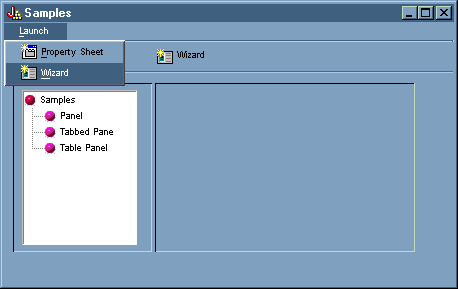
Figure 9 shows how the first wizard dialog gives you many options.
Figure 9: Selecting Rock in the first wizard dialog
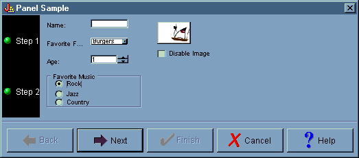
In the first wizard dialog, select Rock and click Next to display the second wizard dialog as shown in Figure 10.
Figure 10: The second wizard dialog (after selecting Rock)
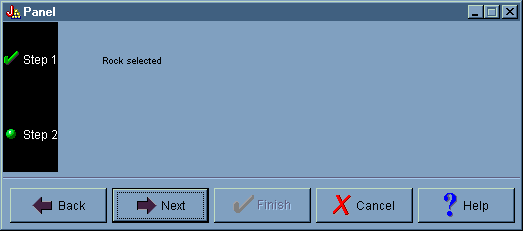
On the second wizard dialog, click Next to display the final wizard dialog as shown in Figure 11.
Figure 11: The final wizard dialog
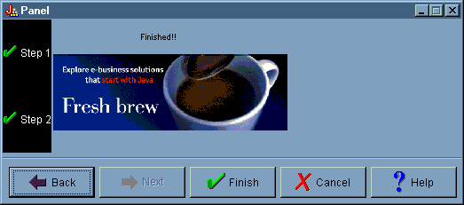
However, this example has been programmed to have a loop. Select Country in the first wizard dialog (Figure 12), then click Next to display the second wizard dialog (Figure 13). Clicking Next in the second wizard dialog loops back to display the first dialog again (Figure 14) instead of the final wizard dialog.
Figure 12: Selecting Country in the first wizard dialog
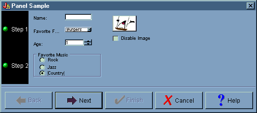
Figure 13: The second wizard dialog (after selecting Country)
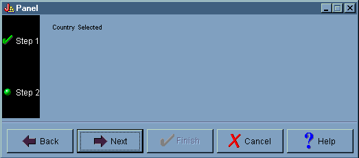
Figure 14: Looping back to the first wizard dialog

In other words, the programmer has determined that nobody can select country as their favorite form of music.
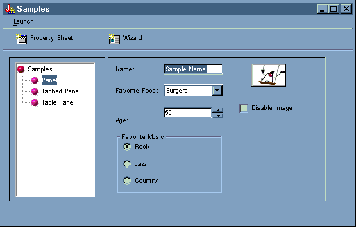
From the GUI Builder example main window, you can also select other functions from the left pane below the toolbar. Figure 15 shows how selecting Panel in the left pane displays the Panel sample in the right pane.
Figure 15: Selecting Panel in the left pane
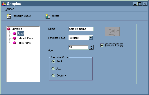
The Panel sample has been programmed with an option to disable the image. Select Disable Image to display the same screen with the image shaded, as shown in Figure 16.
Figure 16: Selecting Disable Image in the right pane
The Panel sample also illustrates the drop-down list box option, as shown in Figure 17.
Figure 17: Selecting an item from the Favorite Food list in the right pane
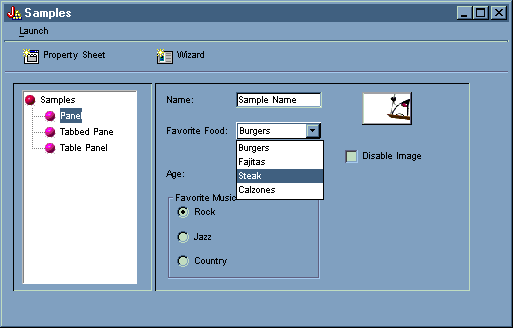
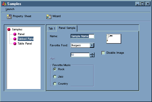
Figure 18 shows how selecting Tabbed Pane in the left pane of the GUI Builder example main window displays the Tabbed Pane sample in the right pane.
Figure 18: Selecting Tabbed Pane in the left pane
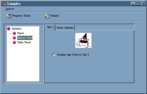
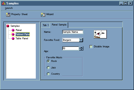
Figure 19 shows the results of selecting the Panel Sample tab in the right pane.
Figure 19: Selecting the Panel Sample tab in the right pane
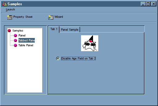
Select Tab 1 again (in the right pane), then click Disable Age Field on Tab 2 to deselect it.
Figure 20: Selecting Disable Age Field on Tab 2 in the right pane
Selecting the Disable Age Field on Tab 2 option deactivates and grays out the Age field in the Panel Sample tab, as shown in Figure 21.
Figure 21: Result of disabling age in the Panel Sample tab
Selecting Table Pane in the left pane of the GUI Builder example main window illustrates the use of a table panel with a custom renderer and a custom cell editor, as shown in Figure 22.
Figure 22: Selecting Table Panel in the left pane
